SUPER BEING LABS

SUMMARY
Super Being Labs was a social innovation studio. I helped them create a website and branding collateral through whimsical storytelling and thoughtful design to raise awareness and drive engagement for various social causes.
Our approach aimed to evoke empathy and inspire action, leveraging design as a powerful tool for positive societal impact.
PROJECT
Super Being Labs (SBL) utilizes design and storytelling to approach tough challenges, such as: post-cancer care, refugee assistance, and other complex systemic issues. I created digital products to continue their good work and help promote positive change.
MY ROLE
Developed a brand identity that supported SBL’s long-term vision
Refreshed existing brand content
Produced website designs to reflect the company’s tone, voice, and personality
Created comprehensive specs for a website design, mobile site, for all UI components and visuals
Created animations to enhance the user experience
Note: The project isn’t live. Only certain work can be shown.

PROBLEM
Super Being Labs is a studio with immense passion and aptitude to do good. They’d already made incredible strides in helping social enterprises change the world for the better but needed a brand refresh to help carry their message even further.
SBL’s ultimate goal is to build a better world through inclusivity, positive energy and creative society-centric solutions. To stand up to this ideology, their brand needed to inspire thought, emotion and action - something that would welcome people in and help spark a movement!
“What if we designed a world that truly enabled the best of human potential, that brought joy to people, that propelled us all to the greatest heights?”
Their website was always a stopgap - they didn't feel that it communicated their story effectively or had enough emotional impact. It felt like a “same old same old website” and I was tasked with updating its UX/UI. However, after reviewing the entire brand identity, I felt it didn’t project SBL’s voice powerfully enough and decided to update other aspects of the brand as well as the website.
DISCOVERY
In my initial meeting with Super Being Labs, we discussed their target market, brand positioning, competition and messaging opportunities.

Working closely with the client, I fleshed out who Super Being Labs was and their expectations for my work. I wrote a detailed design brief, outlined my next 6 months and defined the trajectory for the following 3 phases - research, process work and design.
RESEARCH
1. Target market
Super Being Labs worked with anybody who had a social challenge. Their inquisitive minds meant that their curiosity was an open door to every possibility and challenge.
They wanted to attract people with small ideas, people who wished to create change through art, and people who had big aspirations for a brighter future. Everyone was welcome.

2. Market research
To understand how messaging strategies were implemented by other companies, I researched multiple social enterprises and think tanks. I found that the most influential companies always had a personal touch to their brand/website (i.e. opinion pieces, custom illustrations, a page to see and share community stories). This humanized the companies and lended an authenticity to their missions.

3. Current trends
To ensure my designs were current and would stay relevant long-term, I researched into new types of immersive experiences, UI, photo, illustration, colour, font, and animation trends. I always made sure to gather the most information about our 3 main pillars: Play, powerfulness, and curiosity.
PROCESS WORK
4. Colour
We kept the signature pink because it was one of SBL’s main characteristics. However, I wanted to shift from the greys and introduce primary colours into the palette to maintain our child-like motif. I wanted to bring our thoughts back to art class fundamentals, when we first started learning about colours in elementary school. Reds, yellows and blues were strong statement colours and aligned well with SBL’s personality (i.e. red = passion, yellow = joy, blue = intelligence). I experimented with variants of these colours to look for an edgier, more up-to-date combination.
Our final palette was vibrant, warm and modern. Neon tones gave it a graphic feel, which would translate well into our illustrations.

5. Fonts
Our fonts needed to communicate well and have a strong yet humble personality. I looked for something that was easily readable so people could scan large amounts of content quickly. We also needed flexibility in the number of font styles so we could show different facets of our personality.
I chose the headliner because at a glance, it reminded me of a futuristic storybook. It was approachable yet exciting. It had a bold presence and a unique look.
The body text balanced out the sharpness of the headliner and didn’t overpower it. It was legible, fun and professional.

DESIGN
6. Logo & Mark
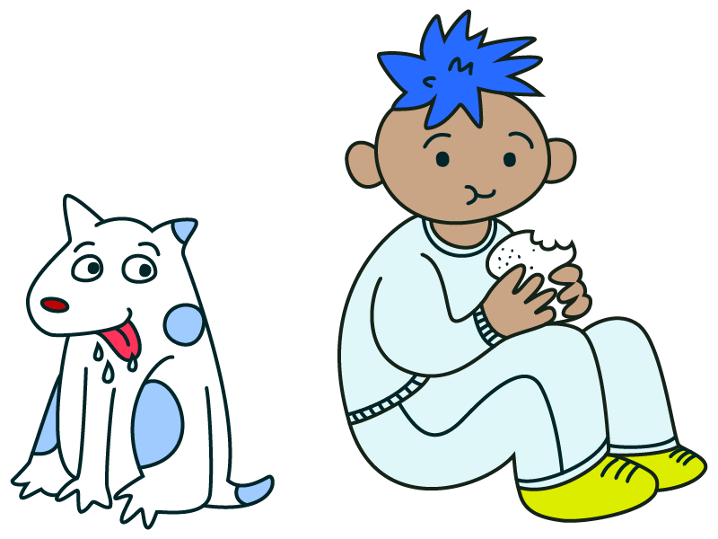
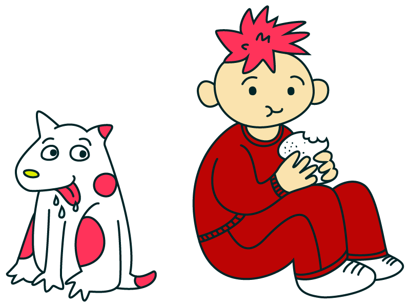
SBL’s belief was that we should all be more like children - curious, caring, funny, inquisitive, and experimental. Since the existing mark embodied all these core values, we decided not to drastically alter it.
I removed the shadows and finer details to simplify the image and flatten the design. Less detail means it’s easier for the eye to process at a glance, especially when the mark is shrunken down in size.

The biggest challenge was to make a logo that was approachable yet professional. I began exploring by asking my friend’s daughter to freestyle the words “Super Being Labs” but the design was dismissed when it was tested as being too illegible.
In the end, I decided to hand draw our name in our chosen headliner font. It gave the logo a slight quirk and a looser feel, but remained strong and legible.
For the mark, we decided to remove all skin colour because we wanted him to be universal - not just be one child, but every child.

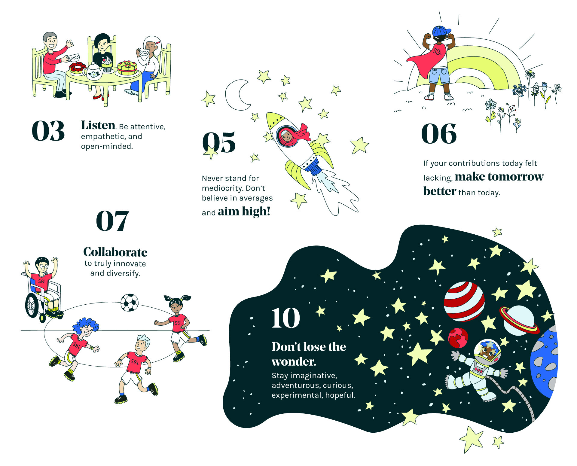
7. Manifesto
SBL has 10 core tenets which forms the backbone of their studio. I envisioned charming, timeless cartoons with good detail to draw the user’s eye. I wanted a joyful ease within each scene so I hand drew every element, making sure it was graphically interesting yet sophisticated.

Samples from the final manifesto:

8. Design system
To construct the website, I needed to lay out the building blocks for the brand. I defined the brand guidelines, component library, UI patterns, animations, and imagery so that we always had one reference source for future designs.
Photo source: Google
9. Animations
The final piece of the puzzle was to create animations that would bring everything to life. The biggest impression SBL had on me was their enormous passion and incredible sense of humour.

I wanted to strike a balance between our child-like motif and our grown-up voice to convey a playful yet professional nature. The animations were drawn in Illustrator and animated in After Effects.


10. Website
Now that I had all the elements, I started putting it all together. Since the website was a platform for the company’s voice and one of the initial touchpoints for potential clients, it needed to have immediate appeal, feel current and have strong messaging.
I began by taking an audit of the current website to look for areas of opportunity, then laid out wireframes for each page.
The final website design. After multiple iterations, I laid out 8 separate screens for both desktop and mobile. Samples below:
Desktop - Work With Us page (photos taken from Google)
Desktop - Our Team page (not animated)
Mobile - Our Projects page (not animated) (photos taken from Google)
RESULTS
Unfortunately, we weren’t able to finish the brand development process - implementing, tracking, and adjusting due to situations out of our control
Next time: I’d want to do further testing. More qualitative and quantitative feedback would help improve the messaging and impact
I’d also want to design more customer touchpoints (i.e email campaigns, social media, events, etc.) to raise more awareness